Exploding Bubbles: Visualising Multi-dimensional Data using Infragistics Silverlight Controls (Part 2)
In Part 1, I introduced the Exploding Bubbles application.
In this post, I will focus on the data aspects. I would recommend that you download the source code and refer to it as required.
Getting Data Into the Application
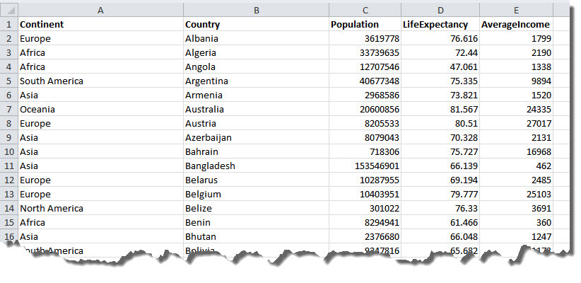
The data source for the Exploding Bubbles application is flat data. i.e. a collection of records under common headings without any structural relationships between them as in an Excel spreadsheet or a database table. In this case, it is an Excel spreadsheet compiled using data publicly available from Gapminder.org, and it looks like this:
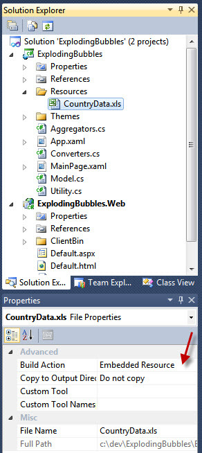
The Excel spreadsheet is embedded as a resource:
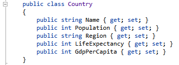
A class is defined to represent each row of the spreadsheet:
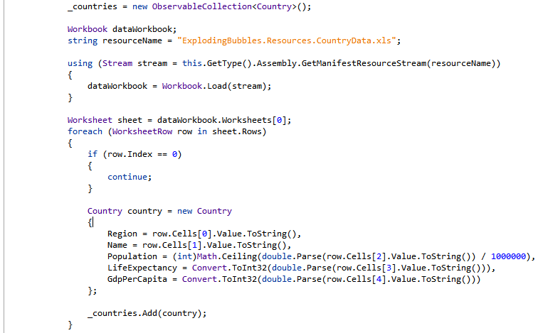
The Infragistics Excel Library is used to read the data from the Excel spreadsheet into a collection:
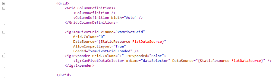
The following XAML adds a flat data source:

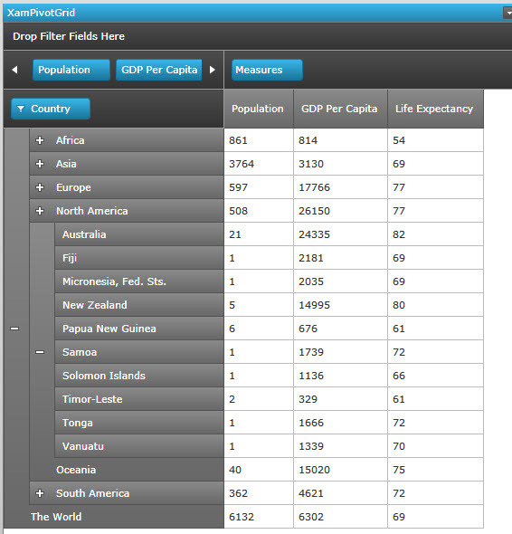
The following XAML displays a Pivot Grid that binds to the above data source:
Understanding Multidimensional Data (or, What is an OLAP Cube Anyway?)
So how does the flat data get converted into the hierarchical structure that you see here?
The Infragistics Pivot Grid’s Flat Data Source takes the flat data and creates multidimensional data from it i.e. an in-memory OLAP cube. This is incredibly powerful because it lets the user analyse the data any way they like. To understand this better, consider a spreadsheet with sales data that looks like this (from this sample which is part of the Infragistics Silverlight Data Visualization samples browser):
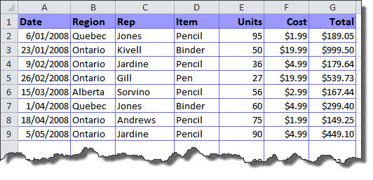
When this is converted to multidimensional data, a ”dimension” is automatically created from each column and a “measure” is automatically created from each numeric column. These are displayed in the Pivot Grid’s Data Selector:
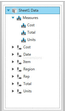
Now, suppose we want to look at units sold region-wise and item-wise, then we simply needs to drag the dimensions (i.e Region and Item) to the Rows or Columns area and the measure (i.e. Units) to the Measures area.
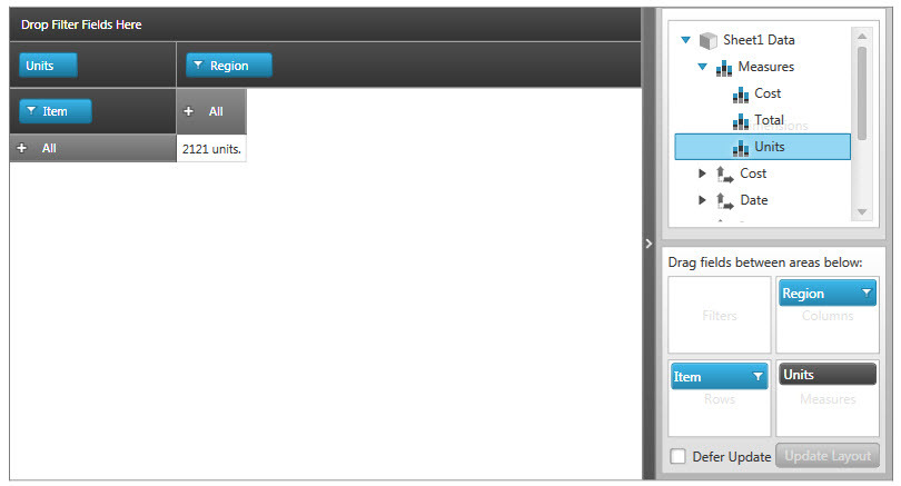
We can now see that there there were 2121 units sold. We can analyse this by drilling down into the Region dimension:
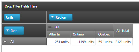
… or the Item dimension:
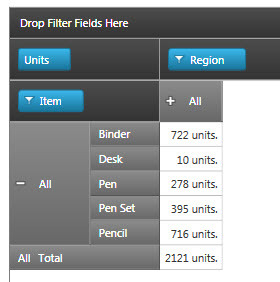
… or both:
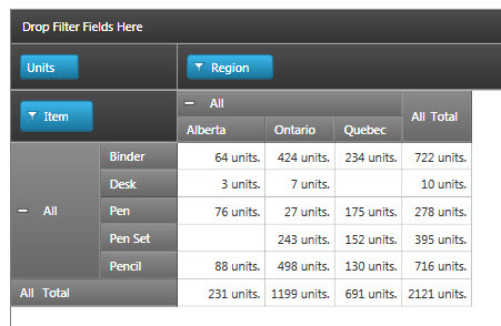
The Pivot Grid’s data source takes care of all the calculations!
The data can also be filtered by clicking on the filter icon next to a dimension, or by introducing another dimension by dragging it to the filters area.
Adding Hierarchy Descriptors and Custom Aggregators
In the sample above, if the dimension is a date, then by default a hierarchy is automatically created:
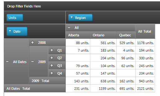
This is the concept used to convert the flat list of countries in the Expoding Bubbles application to a hierarchy organised by continent. The Pivot Grid’s Flat Data Source, gives you the ability to specify a custom hierarchy via “hierarchy descriptors”:
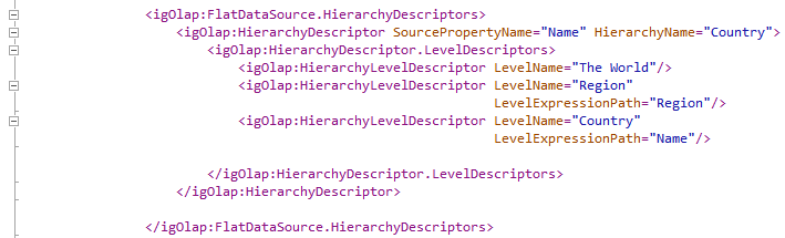
This code tells the Flat Data Source to group countries into Regions (continents) using the Region property and then group the Regions into The World.
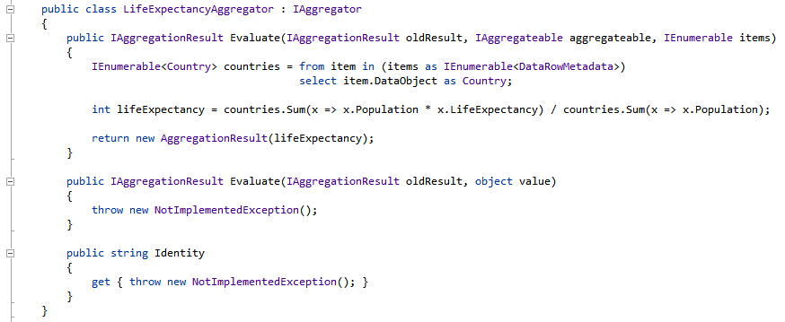
One final bit of customisation needs to be done to make the hierarchy work properly. By default, the Flat Data Source sums the child items when rolling-up a hierarchy. This is the default “aggregation” behaviour. This works fine for population because the population of a continent is the sum of it’s constituent countries (and the total population of the world is the sum of all it’s children i.e. continents), but this does not work for life expectancy because the sum of the life expectancies of each country within a continent will got give us the life expectancy of the continent as a whole. This is also the case with GDP per capita. Instead of a simple sum calculation, the weighed average needs to be calculated for the aggregate value to make sense. The custom calculation is specified via a custom aggregator.
The LifeExpectancy aggregator performs the weighted average calculation:
The following code tells the Pivot Grid’s Flat Data Source to use a custom aggregator called LifeExpectancyAggregator:
