Exploding Bubbles: Visualising Multi-Dimensional Data Using Infragistics Silverlight Controls (Part 3)
In Part 1, I introduced the Exploding Bubbles application.
In Part 2, I focused on the data aspects.
In this post, I will focus on how the data is visualised using the Infragistics Data Chart, touching on some of the chart’s features including the Motion Framework which is used to animate the bubbles when they explode/implode. As before, I would recommend that you download the source code and refer to it as required.
The Pivot Grid’s data is exposed as tuples (each tuple represents a level in the hierarchy – a country, a continent or the world). In order to render the data, each tuple is converted into a bubble, where a bubble is modeled as follows:
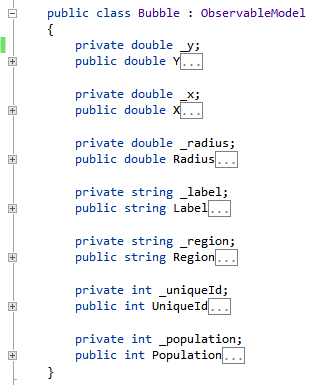
These bubbles are rendered according to the follow criteria:
- The life expectancy is shown on the Y-axis
- The per capita GDP is shown on the X-axis (on a logarithmic scale)
- The population is represented by the size (area) of the bubble
A bubble chart incorporating these criteria is added to the page as follows:
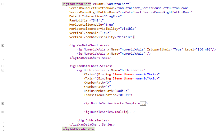
The basic setup of the chart is simple. There are two axes specified, a NumericXAxis and a NumericYAxis. A bubble series is added which is bound to a collection of Bubble objects and the X, Y and Radius are mapped to the corresponding property of the Bubble object. The bubble series is a type of scatter series which also includes scatter line and scatter spline, and which can be shown by replacing BubbleSeries above with the appropriate series name.
In a similar way you can show over 50 different series types using the Data Chart:
- Category series including bar, column, area, line, spline, spline area, step line, range column, range area and stacked and stacked 100 version of these
- Financial series
- Polar series
- Radial series
You can even combine multiple series on the same chart.
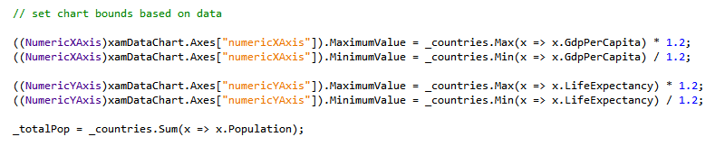
All aspects of the chart can also be set programmatically in in code-behind. For example, the chart bounds are not known at design time, since they are based on the minimum and maximum values of the actual data. They are therefore set in the code-behind when the data is loaded:
There is a 2-way synchronisation between the Pivot Grid and the Data Chart i.e. when the Pivot Grid’s data changes (by expanding a hierarchy for example), the chart is updated, and when the chart changes (a bubble on the chart is exploded for example) the Pivot Grid reflects the change. This is achieved by handling the appropriate events on the grid and the chart. The chart updates itself on the Pivot Grid’s DataSource_ResultChanged event, and triggers the Pivot Grid to expand/collapse a hierarchy when a bubble is left-clicked or right-clicked via the xamDataChart_SeriesMouseLeftButtonDown and xamDataChart_SeriesMouseRightButtonDown events.
The style and colour of the bubble is set by creating a custom marker template:

There are various options available to colour the bubbles. For example a colour scale can be specified (two or more colours) and the chart will automatically apply generated colours in between according to the radius, X value or Y value of the bubble.
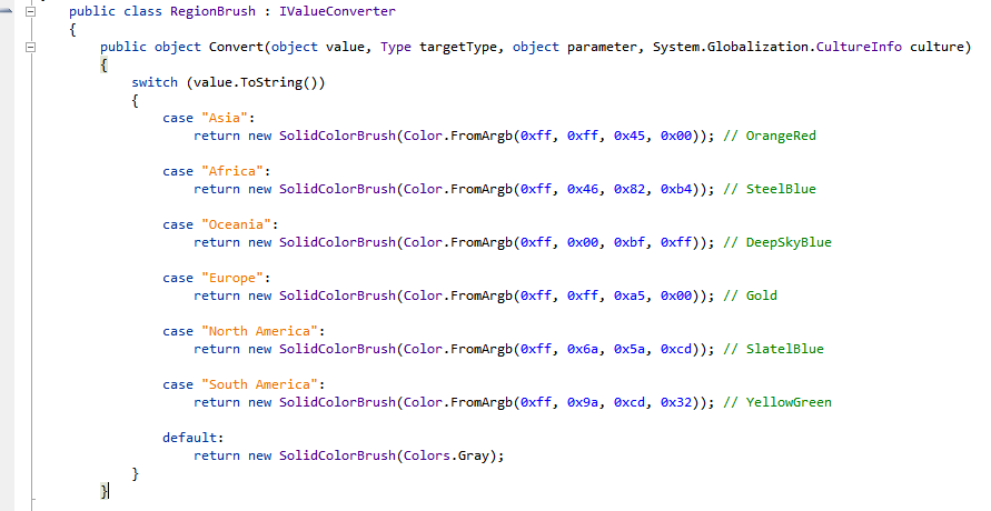
In this sample, the colours are specified as discrete values based on the region represented by a bubble. The region brush value converter contains this logic:
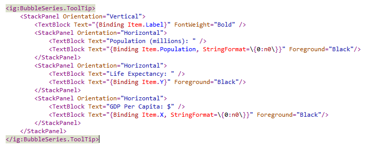
You have complete flexibility over the tooltips. In this example, a custom tooltip is defined as follows:
Drag and zoom capability is added by simply setting the DefaultInteraction to “DragZoom” and setting HorizontableZoomable and VerticalZoomale to true. This allows the user to zoom in to the chart using the mouse scrollwheel or by drawing a box around the area to be zoomed in.
Once zoomed in, the chart can be dragged around.
Finally, I will discuss how the bubbles are animated when exploded/imploded. This uses a feature of the chart called Motion Framework. At the heart of this feature is the capability of the chart to smoothly animate values as they are updated. Please read my post, Infragistics Motion Framework 101 to understand this.
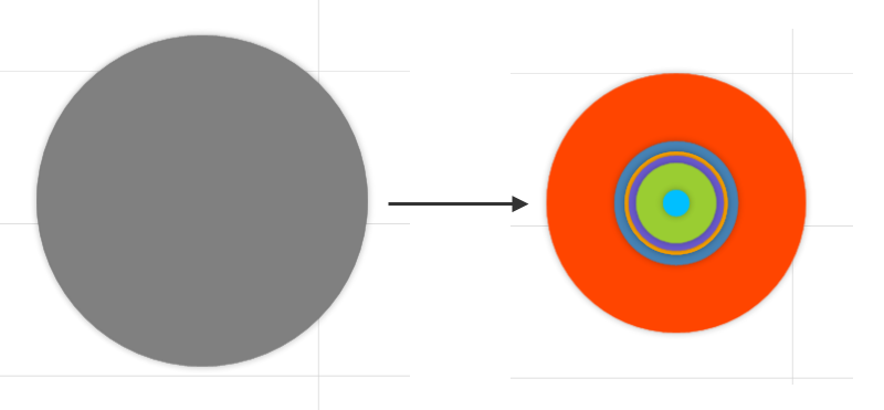
The explosion effect happens in two steps. First, when a bubble is clicked, it is replaced by it’s children at the exact same location:
Next, the location of each child bubble is set to it’s real location. The Motion Framework kicks in and animates each bubble from it’s starting position to it’s final ending position:
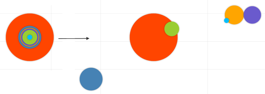
Collapsing bubbles happens in reverse. In the first step, bubbles are collapsed by setting their end location to the location of the parent bubble. Once the bubbles are centered, they are replaced by the parent bubble.
This is just one of the many ways to use the Motion Framework. It’s versatility is limited only by your imagination.
In Part 4, I wrap up this series of posts, discussing styling, docking and cloud deployment.