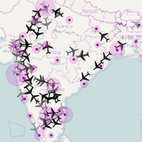
In January, I created an animated visualization showing the movement of domestic flights of Indian carrier Jet Airways over the course of a day:

The time of day is depicted using a slider that moves across horizontally over time:

The motivation behind this visualization, besides trying to build something cool, was to showcase the capabilities of my former employer’s Geographic Map API and encourage developers to build map-based visualizations.
I am thrilled to see that a similar approach is taken by Google’s visualization of flights to and from London, which was released earlier this month:

The time of day in this case is depicted using a simple clock:

This visualization is part of the More Than a Map website showcasing the capabilities of the Google Maps API – do check it out.
I’ve always been a big fan of Google Maps. I remember looking at the newly released Street View feature in 2007 and shaking my head in awe. And MapsGL released earlier this year produced a similar reaction.
What’s great for developers is that they can leverage all of the goodness of Google Maps via the API for free! What will you build?