User Experience

Searchable Menus: Using Text to Navigate Complexity

The Problem

One of my favourite features of my Samsung Galaxy SII is it’s ability to create a Wi-Fi hotspot. I find myself using it regularly to give my laptop internet access when I forget my 3G USB modem at home or when I travel to a city where the modem’s carrier doesn’t have 3G services.

The hotspot works like a charm, but getting to the menu item to activate it however, is a pain as the following screenshots show:

2image

Similarly, the other day I was editing a document in Word and wanted to edit the header. Call me stupid, but I couldn’t figure out how to do it! After a couple of minutes of trying to figure it out, I ended up having to Google “Word 2010 Header”.

Both these scenarios highlight the huge and ever-growing problem of navigating complexity in software. But it’s not as if software developers are not trying to address this issue. Microsoft for example, has put in a massive amount of effort in making the Office menu usable as it grown more complex, and their latest solution is the Office Ribbon. You can read the story of the Office Ribbon, and take a trip down memory lane. I “borrow” a couple of slides from Jensen Harris’ deck to quantitatively illustrate how menu complexity has grown over the years:

Image
Menus2
So how do we navigate this complexity and get to what we need quickly even if it is buried several levels deep? What we currently do is learn how to get to a particular menu item, then try to memorise it for the future. It may take us a few tries before it is committed to memory. Then, everything is OK until a new version of the software is released, we have to learn it all over again. The level of angst this causes has probably been unknown until social networks came along and allowed users to give instant feedback. It is clearly evident from the number of exclamation marks that accompany Facebook status updates every time the Facebook layout changes. Yes, we ultimately get used to it the new layout and the new way of managing privacy, but the amount of time wasted is phenomenal!
 
This is certainly not the shortest distance between “our brain thinking we want to do something” and “actually performing the activity”. The ideal solution is of course, the device just reading our thoughts, and while there is some amazing research going into making this a reality, we are still stuck with giving commands to our machines for now. Meanwhile, Apple is once again pushing the boundaries of user experience, but voice commands have clear limitations and are not suitable for general purpose use. At least not yet.
 

The Solution

I believe there is a simple, elegant solution to the problem that we can apply immediately. It is the idea of making menu items searchable using text, or simply “Searchable Menus”.
 
Specific implementations of this proposed “Searchable Menus” pattern would of course vary according to device, platform and type of application.

Consider the scenario of firing up the WiFi hotspot on my phone. If I search for “hotspot” this is what I get:

4image
 
The Google Search Android app already searches apps, text messages, and visited web pages, so why not menu items as in the following mockup?
 
5image
 
Similarly, in Word, a “Command Search” pane or similar UI element could be used to enable searchable menus.
 
Revisiting the header editing scenario, one would simply need to type in “header” and get a list of relevant menu items as follows:
 
3image

Searchable menus can be context sensitive. For example, I would just select some text and type in “super” into the “Command Search” , which would list relevant commands:

1image
 
This way, I get Word to do what I want in what soon after me thinking “I want to make this text superscript” and getting Word to do it for me.

Searchable Menus also solves the problem of relearning software every time a significant change to the UI is made.

Predictive analytics could be used to optimise the search results for the particular user. For example, often used commands could appear larger or nearer the top of the search results or use colour to stand out. It could also be used to suggest items that have the same meaning as what has been typed in, so we don’t have to remember exactly what the menu item is called. Relevant data could be stored in the cloud so that moving from one platform or device to another would be smooth and seamless.

Ultimately, I believe Searchable Menus have huge potential to make users more productive in an increasingly complex world. Further, I think they have the possibility of changing our thinking away from a “one size fits all” solution (e.g. designing menus around the “the 80-20 rule”) to one that is more customised to the user.

What do you think?

Standard
Talks, User Experience

My Talk at India HCI 2011: “A Pragmatic View of UX Driven Development”

Thanks to the India HCI 2011 organisers for inviting me to speak at this year’s conference in Bangalore.

It was great to meet and listen to thought leaders from India and around the world in this space.  Of particular interest were:

  • research into AR (Augmented Reality) by HITLabNZ
  • eye-tracking technology from SMI and Tobii
  • the work being done on bottom-of-pyramid empowerment through mobile by Microsoft Research
  • design-thinking approach to building exchanges for virtual economies (MMORPG “money”, frequent flier miles, credit card reward points etc.) by Cognizant Technology

I talked about how using UI toolkits that a) have broad and deep functionality exposed by a powerful design-time interface and b) that are “pattern aware” is a winning strategy for UX driven development since they:

  • minimise the disconnect between the customer, UX practictioner and developer by enabling the easy creation of high-fidelity prototypes
  • effectively address the challenges of time, budget, developer ability and the growing need to target multiple devices

As promised here are the slides:

Standard
User Experience

Don’t Tell Me, Show Me!

It turns out that one of the key evolutionary adaptations that sets human being apart is the ability to simulate experiences.  According to psychologist Dan Gilbert, in his fascinating talk on what makes us happy, ‘it’s right up there with standing upright, language and opposable thumbs as one of the things that got our species out of the trees and into the shopping mall.’  It’s because of this experience simulator that Ben & Jerry’s don’t have a “liver & onion” ice cream flavour.  And it’s not because they made some up and tried it, it’s because we can simulate the experience in our heads while sitting in our armchairs.

It also turns out that our experience simulator is flawed.  It works well for some types of experiences and not so well for others.  Software is notorious for being firmly in the “not so well” category as illustrated by this classic cartoon:

I’m not a psychologist but I think it’s safe to say that software is simply too complex to be adequately simulated by the brain just by using words.  If you think about it a software requirements specification is just that – a simulation of the actual software to be built using words.  So if it’s so inadequate as a tool to simulate how a piece of software will function, then why has it been so popular as the primary means of documenting and communicating requirements?

In my experience, one reason for the popularity of the SRS is to constrain scope or to put it more bluntly, to cover one’s behind.  The team or organisation building the software has an interest in constraining scope because often attached to the scope are time and resource commitments.  If at a later stage the customer wants changes, then the SRS is used as a tool to justify more resources.  “Sorry, that wasn’t in the original spec, we’re going to have to charge you more /it’s going to take longer / we need more developers.”

But I think the primary reason is that software emerged from electronics engineering and so naturally electronics engineers tried to apply the the engineering principles and methods that worked so well for them.  As a case in point, consider the name of the industry standard for a software requirements specification document: IEEE 830.  IEEE stands for Instution of Electrical and Electronics Engineers.  Wait a minute?  What are electrical and electronics engineers doing defining how software should be specified?  I think they should stick to defining things that are, well, about electrical and electronics engineering.  Like WiFi: IEEE 802.11.  But the truth about the nature of software emerged over time.  Software is as much art as it is engineering.  It’s as much a creative endeavour as it is a scientific one.  There are aesthetics and other human factors involved just as there are when building a house, another activity that combines art and engineering.

Because software is a human invention, it isn’t bound by the laws of physics or chemistry.  It is limited only by the bounds of human imagination.  That makes it a field that evolves at a furious pace, constantly entering into unexplored territory and with limitless opportunities to innovate.  All this makes it a very exciting area to work in but it also means that there are a lot of unknowns both in the problem and solution spaces.  In other words, the customer rarely has a clear idea of what he wants (“I know what I want when I see it.”), and the business analyst or architect rarely has a clear solution.

In a recent episode of the television show Mythbusters, President Obama  asked the Mythbusters Adam Savage and Jamie Hyneman to revisit (spoiler alert!) the previously busted “Archimedes’ Death Ray” myth that Archimedes constructed a death ray by reflecting sunlight onto, and thus igniting, Roman vessels.  A key challenge in the revisit was to design an aiming mechanism that would allow 500 people to aim  at a single point their individual rays reflected off mirrors.  Adam and Jamie both tested ideas in small scale.  While experimenting with his idea, Adam realised that the idea itself was not feasible.  But in process of experimenting with it and “seeing it”, he had a an “Eureka moment” which led to a much more superior design, one that was eventually used in the actual full-scale experiment.  ‘Failure is always an option’ is one of Adam Savage’s favourite sayings and the process of designing the aiming mechanism illustrates why.  At the end of the episode, Jamie Hyneman says, ‘When we experiment, when we try things, and we fail, we start to ask why… And that’s when we learn.‘  This learning through experimenting and failing is typical in software development.

So how can you efficiently deliver what the customer wants and at the same time facilitate experimentation and learning? Through mockups, prototypes and iterative development. All these techniques cater for the inherent complexity of software, the power of visualisation and the usefulness of learning through experimenting.

Here are the various techniques I’ve discussed so far on a heatmap showing fidelity vs. ease of creation.
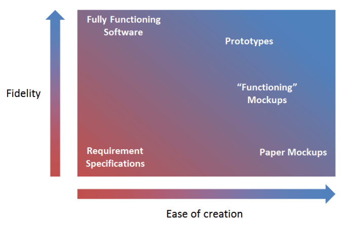
Mockups allow the customer to effectively simulate what the end software is going to be.  Paper mockups are of course the simplest way to nut out a concept for a user interface.  There are lots of software tools for creating “functioning” mockups that simulate the final work software.  Some excellent ones are iRise and StetchFlow.

Prototypes take this one step further and actually include key working parts allowing the customer to play with the software and the development team to experiment with certain ideas, test them out and in the process refine the solution without a lot of investment.  The key type of tool that enables prototype creation is user interface controls that provide a lot of rich functionality out of the box and are easy to use (such as those made by my company Infragistics; the added benefit of using Infragistics controls is that you get a lot of UX (user experience) expertise, knowledge and investment baked into the controls, and so your prototypes automatically have rich UX that users/customers love.)  Prototypes are the sweet-spot of high fidelity and ease of creation.  Using rich UI controls that will be used in actual development means that there is no disconnect between what the user sees and what is finally delivered.  The gap between the problem and solution spaces is minimised with minimum effort.

Iterative development by incrementally adding functionality that is tested by the customer simultaneously conserves development efforts and satisfies customer requirements effectively.  Agile project management, test-driven development and continuous integration are some aspects that in my experience are incredibly effective in facilitating this.

I’d like to thank my favourite professor at university, Pj Radcliffe for arming me with these thoughts and tools very early on in my career.  Thanks Pj!

Archimedes constructed a death ray by reflecting sunlight onto, and thus igniting, Roman vessels.

Standard
User Experience

UX Lessons: Cleartrip

There is a plethora of flight booking websites in India: MakeMyTrip, Yatra, Ixigo, Ezeego etc. I have tended to mainly use MakeMyTrip.  That is, until now.

Enter Cleartrip which delivers, simply put, a great user experience.

Let me highlight some things I like.

Design, Layout & Navigation

  • The layout and navigation are simple, uncluttered and clear.  Good use of whitespace.  The visual design is obviously inspired by Google.  Who better to ape?
  • From and To cities are autocomplete textboxes so I can type the first few letters of the city name rather than having to select the city from a long list like with some other travel websites.  The autocomplete is smart so I can type the airport code instead:

UX Lesson: It’s easier to type when the user has to choose from lots of data.

Typing is easier than pointing and clicking.  That’s why I think Spotlight is so awesome and Desktop Search is the killer feature in Windows 7.

Performance

The site feels quite snappy (much faster than the other sites out there).

UX Lesson: Performance is a key part of the overall user experience.

‘Memory’, Ease of Booking & Account Creation

  • I was searching for some flights but got interrupted and when I went back to the site it remembered the details of my last search.  Note that I didn’t create an account – it just remembered.
  • I didn’t have to create an account to book my flights.  I just needed to provide the minimum information required to make a booking and pay for the flights and I received an email with my ticket details.
  • What happened next is great.  I received a separate email saying that an account had been created using the basic information I have provided at the time of booking.  I had the option to activate the account by providing a password and some additional details.  This is a great example of breaking down barriers to using your application.

UX Lesson: Be smart about the information you collect and remember it so that the user doesn’t have to retype it.

UX Lesson: Don’t force the user to create an account unless absolutely necessary.

Everyone hates creating accounts.  Nobody wants to keep track of yet another username and password.  So the best thing you can do is simply to let the user use an account he already has.  OpenID seems to be the de-facto way to achieve this and StackOverflow does an excellent job.  Kudos to Jeff Atwood.

Other Little Things That Make a Big Difference

  • The subject of the confirmation email is clear and meaningful: Ticket for Mumbai – New Delhi one-way flight — Trip ID XXXXXXXX.  This is great if I’m searching my mail in a hurry to print out the ticket or check flights details.  Much more useful than something like MakeMyTrip E-Ticket for Booking ID FLT0000XXXXXX
  • If I log in, I can see a list of upcoming trips and cancel tickets.  I can also apparently see the refund amount before I cancel but this didn’t work for me because of some fare code information not being updated or something.  But at least Cleartrip was good enough to give me a plausible reason for this feature not working as advertised and provide customer service contact details.

UX Lesson: UX is about paying attention to lots of little things that all combine together to make a big difference.

The user experience is my no means perfect.  For example there are some interesting innovations like Graphs but they didn’t work.  But the point is that the few things that stand out are enough for me to switch over to Cleartrip.  They show that they have put real thought into making the booking experience simple and hassle-free.  The cost for me to switch is minimal so I will.  But if something better comes along I’ll switch again.  So in order to be competitive and stay competitive it’s not enough just to design for UX upfront but instead to to view it a continuous process.   I therefore think that organisations that integrate UX design into the development process will win.

Standard