A few months ago I wrote about creating a submission for the Digit Recognizer tutorial “competition” on Kaggle that could correctly recognize 95% of handwritten digits.
Enthused by this, I decided to participate in a real competition on Kaggle, and picked the Yelp Recruiting Competition which challenges data scientists to predict the number of “useful” votes a review on Yelp will receive. Good reviews on Yelp accumulate lots of Useful, Funny and Cool votes over time. “What if we didn’t have to wait for the community to vote on the best reviews to know which ones are high quality?”, was the question posed by Yelp as the motivation for the challenge.
I am pleased to report that I ended the competition in the top one-third of the leaderboard (110 out of 352). Although the final result was decent, there were many stumbling blocks along the way.
Data
The training data consisted of ~230,000 reviews along with data on users, businesses and checkins. The data was in JSON format, so the first step was to convert it to tab-delimited format, using a simply Python script, so that it could be easily loaded into R.
Visualization
Next, I tried to understand the data by visualizing it. Here is a distribution of the number of useful votes:
Evaluation
Because Kaggle only allows two submissions every day, I created a function to evaluate the results of the prediction before submission, by replicating the algorithm used by Kaggle to evaluate the results i.e. the Root Mean Squared Logarithmic Error (“RMSLE”):

where:
- ϵ is the RMSLE value (score)
- n is the total number of reviews in the data set
- pi is the predicted number of useful votes for review i
- ai is the actual number of useful votes for review i
- log(x) is the natural logarithm of x
Refining the Model
Next, I split the data into training and validation sets in a 70:30 ratio and created a linear regression using just two independent variables: ‘star rating’ and ‘length of review’. This model resulted in an error of ~0.67 on the test data i.e. after submission.
Next, I hypothesized that the good reviews were written by good reviewers and for each review, calculated the average number of useful votes that the user writing the review received for all the other reviews that he/she wrote. Including this variable reduced the error dramatically to ~0.55.
Next, I incorporated more user data i.e. the number of reviews written by the user, the number of funny/useful/cool votes given and the the average star rating. None of these variables proved to be predictive of the number of useful votes with linear regression so I tried random forests, but to no avail.
Next, I incorporated business data to see if the type of business, the star rating or number of reviews received would increase the predictive power of the model. But again, these failed to reduce the error.
Next, I incorporated checkin data to see if the number of checkins would improve the model. Again, this failed to reduce the error.
Having exhausted all the easy options, I turned to text mining to analyze the actual content of the review. I split the reviews into two categories – ham (good reviews with more than five useful votes) and spam (bad reviews with five useful votes or less). For each category, I created a “term document matrix” i.e. a matrix with terms as columns, documents (review text) as rows and cells as the frequency of the term in the document. I then created a list of the most frequent terms in each category that were distinct i.e. that were only in one category or the other. To the model I added variables from the frequencies of each of these words and in addition added the frequencies of the exclamation mark (!) and comma (,). The final list of words for which I created frequency variables was:
- , (comma)
- !
- nice
- little
- time
- chicken
- good
- people
- pretty
- you
- service
- wait
- cheese
- day
- hot
- night
- salad
- sauce
- table
The frequency variables improved the predictive power of the model significantly and resulted in an error of ~0.52.
Visualization of Final Model
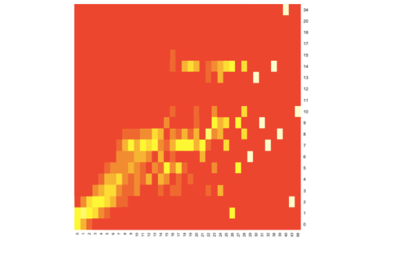
Here is a heatmap of predicted (x-axis) vs actual (y-axis) useful votes:

For lower numbers of useful votes (i.e. up to ~8) there is a relatively straight diagonal line indicating that by-and-large the prediction and actual values coincide. Beyond this, the model starts to falter and there is a fair amount of scattering.
Improvements
I couldn’t find time to improve the model even further, but I am fairly confident that additional text mining approaches such as stemming and natural language processing would do so.