The other day, I was showing a colleague how to use Python and Jupyter notebooks for some quick-and-dirty data visualization. It reminded me of some work I’d done while competing in the MIT Big Data Challenge. I meant to blog about it at the time, but never got down to it. However, it’s never too late, so I’m starting with this post.
The Visualization
The main point of this post is the following animated visualization which overlays a heatmap of the pickup locations of around 4.2 million taxi rides over a period of about five months in 2012 on top of a map of downtown Boston. The interesting thing about the heatmap of pickup spots is that it reveals the streets Boston, and highlights popular hotspots. Overlaying it on the actual satellite map of Boston shows this more clearly:
Those familiar with Boston will see that main streets like Massachusetts Ave, Boylston St and Broadway are starkly delineated. Hotspots like Fenway Park, Prudential Center, the Waterfront and Mass General Hospital show up quite clearly. The three most popular hotspots appear to be Logan Airport, South Station, and Back Bay Station, which is very much to be expected. I remember several occasions where I’ve taken a cab from these places after a night out or returning home after a flight or Amtrak, particularly on a freezing winter day!
The Challenge
Even though the challenge is a few years old (winter of 2013-2014), the context is still very much relevant today, perhaps even more so. The main goal of the challenge was to predict taxi demand in downtown Boston. Specifically, contestants were required to build a model that predicted the number of pickups within a certain radius of a location given (i) the latitude and longitude of the location, (ii) a day, and (iii) a time period (typically spanning a few hours) in that day. In addition, information about weather and events around the city was also available. Such a model has obvious uses – drivers on the likes of services like Uber and Lyft could use it to tell where future demand is likely to be, and use that information to plan their driving and optimize their earnings. The services themselves could also use it to anticipate times and locations of high demand, and to dynamically meet that demand by appropriately incentivizing drivers well in advance through surge —err, I mean dynamic pricing, so that there is enough time to get enough drivers at the location by the time the demand starts to pick up.
I was thrilled when after a lot of perseverance, I finally managed to get on the leaderboard. My self-congratulations were brief though, as I was soon blown away. Which was not surprising in the least; this challenge was organized at MIT’s Computer Science and Artificial Intelligence Lab after all. Enough said.

Getting on the leaderboard, albeit briefly, was fun. But winning was never the goal. Rather, my goals for competing in the challenge were three-fold. First, I wanted to getter a deeper understanding of data science workflows and processes through a relatively complex project. Second, I wanted to expand my machine learning skills. Finally, I wanted to try using Python (and in particular scikit-learn). So far I’d only used R for building predictive models (recognizing handwritten digits and predicting the number of “useful” votes a Yelp review will receive). But I had recently learned Python and had used it extensively during my summer internship at Google building analytical models for Google Express and Hotel Ads. One of the main drivers was that I was about to start an product management internship at a stealth-mode visual analytics startup called DataPad founded by the Wes McKinney and Chang She, the creators of Pandas (the super popular Python library that I had used extensively in my work at Google), and wanted to be prepared with some product ideas.
In the end the process was extremely educational and led to many insights in several areas of data science and machine learning. I even distilled some of the work for a Python for Data Science Bootcamp which I conducted for the MIT Sloan Data Analytics Club along with my co-founder and co-president. I’ll write about some of the learnings and insights in future posts, but for this one one I’d like to talk briefly about the heatmap visualization from the start of this post.
The Making Of
Inevitably the first thing one does when encountered with a new dataset, particularly for a predictive challenge such as this, is to understand the “shape” of the data. To help with this, it’s fairly typical to create visualizations using one or more variables from the data. So the first thing I did was to fire up IPython Notebook (now known as Jupyter), and start to look at the pickups dataset provided.

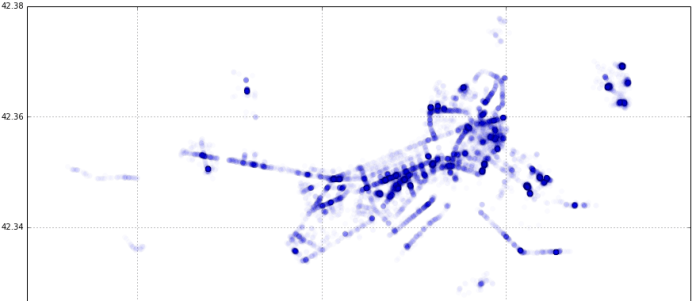
After staring at it for a while, the proverbial light bulb went off in my head. Even though longitude and latitude are measured in degrees and are used to indicate a point on the surface of a the earth which is a sphere, what if they could be used as Cartesian coordinates for a scatter plot on a plane with longitude on the y-axis and latitude on the x-axis? I tried precisely that (for just one day’s rides) and lo and behold the map of downtown Boston was revealed:

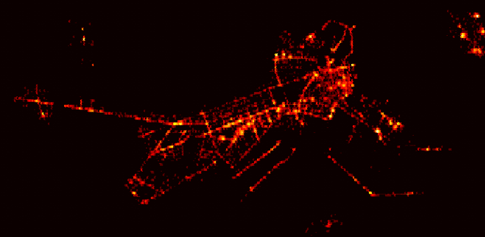
It became obvious that for a small area (relative to the size of the earth) like Boston, the curvature of the earth could be ignored. From here, creating a heatmap was fairly straightforward. I used matplotlib’s hexagonal binning plot (essentially, a 2-d histogram) with a logarithmic scale for the color map. If you’d like to understand it from the ground up, I made a simple step-by-step introductory tutorial of data visualization in Jupyter that ends with the the generation of this heatmap for the MIT Sloan Analytics Club “Python for Data Science” bootcamp .

To create the visualization for this post, I redid the heatmap using all the pickup data available (around 4.2 million pickups over 5 months) and used a different color palette to end up with this:

The code can be found here, but the full dataset itself is not included because it’s over 300MB in size and GitHub has a limit of 100MB.
Then it was a matter of taking a satellite photo of Boston, and messing about with GIMP to overlay the heatmap on top of it, create the animation by blending the two, and exporting it as an animated GIF. This was the first time I used GIMP in anger (I always thought it was for Linux and didn’t realize there was a Mac app available), and I have to say it’s pretty awesome as a free alternative to Photoshop. It doesn’t quite feel like a native Mac app — the behavior and look of the menus and navigation are a little funky— but it got the job done really well for what I needed to do.
Bonus Interactive Visualization
While trying to figure out the best way to present the heatmap overlayed on the Boston map (and eventually settling on the simplicity and versatility of an animated GIF), I came across the cool “onion skin” image comparison feature of GitHub. Click on “Onion Skin” in the image comparison that shows up for this commit.

You can use a slider to manually blend the two images and clearly see the how the taxirides heatmap maps onto (pun intended!) the streets of Boston.

Improvements
Even though I was relatively familiar with Boston having lived there for two years, it was still not immediately obvious what some of the specific hotspots where. This could be addressed in a couple of ways:
Alternative “Static” Visualization
Create an similar animated GIF visualization but using a street map with labels.
Dynamic Overlay on “Live” Interactive Map
A better approach would be to create an app that uses something like the Google Maps API to show a ”live” interactive map view that allows the user to use all the features of Google Maps like zooming, switching between street and satellite views etc.. The app would let the user toggle visibility of the overlay heatmap overlay on top of the map. The user could choose from a set of colormaps for the overlay (some would be more suitable for street vs satellite views), and also use a slider to play with the overlay’s opacity (like with GitHub’s onion skin tool).
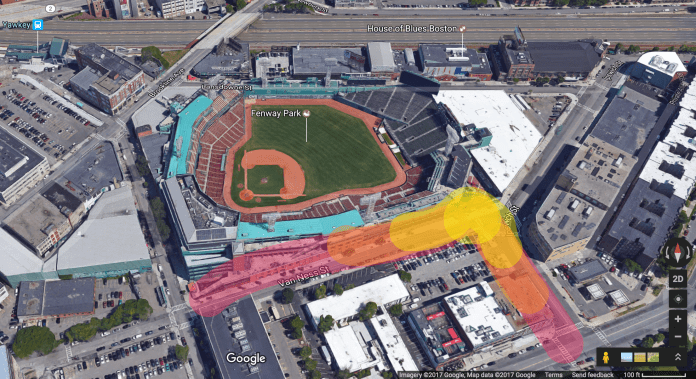
Dynamic Overlay on 3D Map
The next logical step would be to take the dynamic overlay concept and apply it to a live 3D map view. Here is a “concept” of that idea:

