Analytics, Data Visualization

The MIT Big Data Challenge: Visualizing Four Million Taxi Rides

The other day, I was showing a colleague how to use Python and Jupyter notebooks for some quick-and-dirty data visualization. It reminded me of some work I’d done while competing in the MIT Big Data Challenge. I meant to blog about it at the time, but never got down to it. However, it’s never too late, so I’m starting with this post.

The Visualization

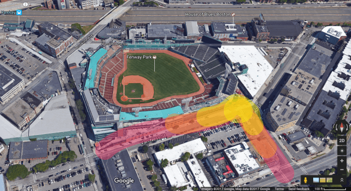
The main point of this post is the following animated visualization which overlays a heatmap of the pickup locations of around 4.2 million taxi rides over a period of about five months in 2012 on top of a map of downtown Boston. The interesting thing about the heatmap of pickup spots is that it reveals the streets Boston, and highlights popular hotspots. Overlaying it on the actual satellite map of Boston shows this more clearly:

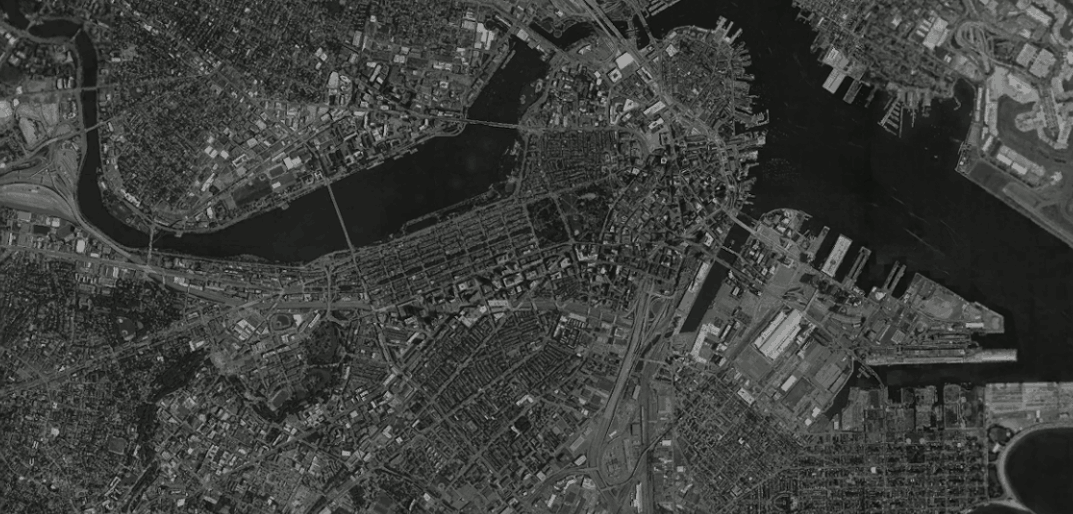
Those familiar with Boston will see that main streets like Massachusetts Ave, Boylston St and Broadway are starkly delineated. Hotspots like Fenway Park, Prudential Center, the Waterfront and Mass General Hospital show up quite clearly. The three most popular hotspots appear to be Logan Airport, South Station, and Back Bay Station, which is very much to be expected. I remember several occasions where I’ve taken a cab from these places after a night out or returning home after a flight or Amtrak, particularly on a freezing winter day!

The Challenge

Even though the challenge is a few years old (winter of 2013-2014), the context is still very much relevant today, perhaps even more so. The main goal of the challenge was to predict taxi demand in downtown Boston. Specifically, contestants were required to build a model that predicted the number of pickups within a certain radius of a location given (i) the latitude and longitude of the location, (ii) a day, and (iii) a time period (typically spanning a few hours) in that day. In addition, information about weather and events around the city was also available. Such a model has obvious uses – drivers on the likes of services like Uber and Lyft could use it to tell where future demand is likely to be, and use that information to plan their driving and optimize their earnings. The services themselves could also use it to anticipate times and locations of high demand, and to dynamically meet that demand by appropriately incentivizing drivers well in advance through surge —err, I mean dynamic pricing, so that there is enough time to get enough drivers at the location by the time the demand starts to pick up.

I was thrilled when after a lot of perseverance, I finally managed to get on the leaderboard. My self-congratulations were brief though, as I was soon blown away. Which was not surprising in the least; this challenge was organized at MIT’s Computer Science and Artificial Intelligence Lab after all. Enough said.

Getting on the leaderboard, albeit briefly, was fun. But winning was never the goal. Rather, my goals for competing in the challenge were three-fold. First, I wanted to getter a deeper understanding of data science workflows and processes through a relatively complex project. Second, I wanted to expand my machine learning skills. Finally, I wanted to try using Python (and in particular scikit-learn). So far I’d only used R for building predictive models (recognizing handwritten digits and predicting the number of “useful” votes a Yelp review will receive). But I had recently learned Python and had used it extensively during my summer internship at Google building analytical models for Google Express and Hotel Ads. One of the main drivers was that I was about to start an product management internship at a stealth-mode visual analytics startup called DataPad founded by the Wes McKinney and Chang She, the creators of Pandas (the super popular Python library that I had used extensively in my work at Google), and wanted to be prepared with some product ideas.

In the end the process was extremely educational and led to many insights in several areas of data science and machine learning. I even distilled some of the work for a Python for Data Science Bootcamp which I conducted for the MIT Sloan Data Analytics Club along with my co-founder and co-president. I’ll write about some of the learnings and insights in future posts, but for this one one I’d like to talk briefly about the heatmap visualization from the start of this post.

The Making Of

Inevitably the first thing one does when encountered with a new dataset, particularly for a predictive challenge such as this, is to understand the “shape” of the data. To help with this, it’s fairly typical to create visualizations using one or more variables from the data. So the first thing I did was to fire up IPython Notebook (now known as Jupyter), and start to look at the pickups dataset provided.

After staring at it for a while, the proverbial light bulb went off in my head. Even though longitude and latitude are measured in degrees and are used to indicate a point on the surface of a the earth which is a sphere, what if they could be used as Cartesian coordinates for a scatter plot on a plane with longitude on the y-axis and latitude on the x-axis? I tried precisely that (for just one day’s rides) and lo and behold the map of downtown Boston was revealed:

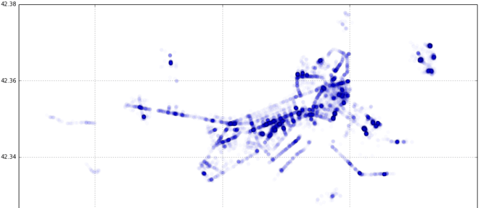
It became obvious that for a small area (relative to the size of the earth) like Boston, the curvature of the earth could be ignored. From here, creating a heatmap was fairly straightforward. I used matplotlib’s hexagonal binning plot (essentially, a 2-d histogram) with a logarithmic scale for the color map. If you’d like to understand it from the ground up, I made a simple step-by-step introductory tutorial of data visualization in Jupyter that ends with the the generation of this heatmap for the MIT Sloan Analytics Club “Python for Data Science” bootcamp .

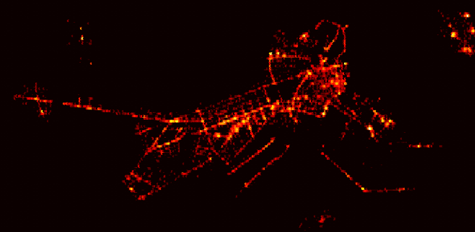
To create the visualization for this post, I redid the heatmap using all the pickup data available (around 4.2 million pickups over 5 months) and used a different color palette to end up with this:

The code can be found here, but the full dataset itself is not included because it’s over 300MB in size and GitHub has a limit of 100MB.

Then it was a matter of taking a satellite photo of Boston, and messing about with GIMP to overlay the heatmap on top of it, create the animation by blending the two, and exporting it as an animated GIF. This was the first time I used GIMP in anger (I always thought it was for Linux and didn’t realize there was a Mac app available), and I have to say it’s pretty awesome as a free alternative to Photoshop. It doesn’t quite feel like a native Mac app — the behavior and look of the menus and navigation are a little funky— but it got the job done really well for what I needed to do.

Bonus Interactive Visualization

While trying to figure out the best way to present the heatmap overlayed on the Boston map (and eventually settling on the simplicity and versatility of an animated GIF), I came across the cool “onion skin” image comparison feature of GitHub. Click on “Onion Skin” in the image comparison that shows up for this commit.

github1

You can use a slider to manually blend the two images and clearly see the how the taxirides heatmap maps onto (pun intended!) the streets of Boston.

github2

Improvements

Even though I was relatively familiar with Boston having lived there for two years, it was still not immediately obvious what some of the specific hotspots where. This could be addressed in a couple of ways:

Alternative “Static” Visualization

Create an similar animated GIF visualization but using a street map with labels.

Dynamic Overlay on “Live” Interactive Map

A better approach would be to create an app that uses something like the Google Maps API to show a ”live” interactive map view that allows the user to use all the features of Google Maps like zooming, switching between street and satellite views etc.. The app would let the user toggle visibility of the overlay heatmap overlay on top of the map. The user could choose from a set of colormaps for the overlay (some would be more suitable for street vs satellite views), and also use a slider to play with the overlay’s opacity (like with GitHub’s onion skin tool).

Dynamic Overlay on 3D Map

The next logical step would be to take the dynamic overlay concept and apply it to a live 3D map view. Here is a “concept” of that idea:

3d_overlay_concept

Standard
Analytics, Data Visualization

Where Do Sloanies Go After They Graduate?

It’s been a year since I graduated from the full-time MBA program at MIT Sloan and moved to the San Francisco Bay Area to work as a Product Manager. I thought it would be interesting to see where Sloanies go after they graduate and, using data from a survey sent out shortly before graduation, came up with an interactive visualization: Sloanies Around the World.

Sloanies Around the World

Clicking on “USA” from the menu presents a clearer picture of where Sloanies ended up in the States:

Sloanies Around the World - USA

The top 4 cities where my classmates ended up are:

  1. Boston
  2. San Francisco Bay Area
  3. New York
  4. Seattle

It is interesting to see how post-MBA career choice determines location. I wanted to remain in software, and chose MIT because of its reputation in technology and entrepreneurship. In fact, technology is the second most popular career choice (after consulting) for Sloanies. Indeed, out of all the M7 business schools, Sloan had the highest proportion of graduates choosing technology (26%). (Source: The M7: The Super Elite Business Schools By The Numbers) For me, the Bay Area was the obvious choice even though it’s on the opposite coast. Many of my classmates echoed this sentiment, which explains San Francisco and Seattle being top post-MBA destinations.

While I’d expect this year’s graduating class to have a similar map, what would be most interesting is visualizations from other schools. I would expect to see maps for schools with a strong finance reputations like Harvard, Booth, Wharton and Columbia be much more heavily skewed towards financial centers like New York.

Standard
Data Visualization

Map-Based Visualization Revisited

In January, I created an animated visualization showing the movement of domestic flights of Indian carrier Jet Airways over the course of a day:

Al flights

The time of day is depicted using a slider that moves across horizontally over time:

Al time  

The motivation behind this visualization, besides trying to build something cool, was to showcase the capabilities of my former employer’s Geographic Map API and encourage developers to build map-based visualizations.

I am thrilled to see that a similar approach is taken by Google’s visualization of flights to and from London, which was released earlier this month:

Google flights

The time of day in this case is depicted using a simple clock:

Google time

This visualization is part of the More Than a Map website showcasing the capabilities of the Google Maps API – do check it out.

I’ve always been a big fan of Google Maps. I remember looking at the newly released Street View feature in 2007 and shaking my head in awe. And MapsGL released earlier this year produced a similar reaction.

What’s great for developers is that they can leverage all of the goodness of Google Maps via the API for free! What will you build?

Standard
Data Visualization

Chroma Chrono: Using Color to Visualize Time

The other day, it occurred to me that one of the oldest and simplest visualizations is the analog clock–it is a visualization of time using angles on a circular scale.

So, I decided to experiment with using color to visualize time and the result is Chromo Chrono:

Chroma Chrono: Using Color to Visualize Time

It comes in two flavors. This is Pulse:

1

A series of concentric circles, going outwards from the centre, represent the hour, minute, second and millisecond. Each circle is colored on a scale that ranges from orange to black.

Depending on whether it is AM or PM, the innermost (hour) circle, gets brighter or darker. It is orange at noon and as the day progresses, it gets darker until it is black at midnight. From midnight to noon, it get progressively brighter until it is orange at noon and the cycle starts again. 

Similarly, the minute and  second circles go from orange to black once every hour and minute respectively in the AM and in the reverse direction in the PM. The millisecond circle pulses from orange to black or vice versa once every second.

This mechanism is inspired by nature–the overall brightness of the clock is an approximation of the overall brightness of the sky.

The Kinetic works on the same principle, except it has rings instead of circles and doesn’t show milliseconds:

2 anno

The main difference, however is a guide inside of each ring that makes it easier to tell the time. In each ring, the point where the color of the ring matches the color of the guide represents the time in exactly the same way as on a traditional analog clock. These points are highlighted using green arrows. If you look at the second ring closely, you will notice that it appears to be somehow moving. This an optical illusion caused by the fact that the point at which the ring and guides match is moving around the circumference of the clock.

Standard
Data Visualization

Visualizing Jet Airways India Domestic Flight Schedules

Like most airlines, Jet Airways publishes flight schedules on their website.

I thought it would be interesting to bring these these schedules to life by creating a visualization showing flights take-off and land as the day progresses.

The result is the Infragistics Flight Watcher app, a showcase for visualizing flights schedules with the Infragistics Geographic Map 2011.2 CTP:

Image
Standard
.NET, Data Visualization

Exploding Bubbles: Visualising Multi-dimensional Data using Infragistics Silverlight Controls (Part 1)

The Short Version

You can interact with the chart by:

  • Left-clicking on bubbles to explode them
  • Right-clicking on exploded bubbles to implode them

[Run Exploding Bubbles]

UPDATE: Exploding Bubbles was made into a showcase application by Infragistics. It was restyled and renamed to Population Explosion. The restyled version can be found here:

[Run Population Explosion]

The Long Version

In a fascinating video titled Nano-data and Now-Casting: The Analytics Revolution, MIT Sloan Professor Roberto Rigobon says,

“The world has a lot of data, now available [sic]. (But), the world has very little information.”

In a previous post, I touched upon the need for innovative ways to make meaning from the large amount of data that we have access to today and the growing importance of analytics:

“Massive amounts of data – either publicly available, or within enterprises – is a defining feature of computing today, and of growing importance for tomorrow.  In fact it’s given rise to a new discipline: data science. As the amount of data grows, traditional methods and tools for making sense of all this data break down and new innovations are necessary.”

One of the ways to understand data is interactive data visualisations. Multidimensional data is especially tricky to visualise because of the complexities of each data point, but if done properly, can provide real insight from the macro- as well as micro-level. A great example of this is the “exploding bubbles” technique, presented by Hans Rosling in a TED Talk from 2006. Look for exploding bubbles starting from around 9m30s into the video.

Inspired by this, I developed the Exploding Bubbles application using Infragistics Silverlight and Silverlight Data Visualization controls.

Here is a video of Exploding Bubbles in action:

This is what the application looks like when you first run it:

Image001

On the left you will notice a pivot grid showing multidimensional data. On the right is a bubble chart, a visualisation of that data.

The pivot grid shows global “health and wealth” statistics. The data is plotted on the chart in the following way:

  • Population is depicted by bubble size
  • GDP Per Capita is depicted on the X-axis on a logarithmic scale
  • Life Expectancy is depicted on the Y-axis on a linear scale

You can interact with the chart by:

  • Left-clicking on bubbles to explode them
  • Right-clicking on exploded bubbles to implode them

You can also interact with pivot grid by expanding or collapsing rows – the bubble chart is synchronised with the pivot grid’s data.

Image002
Image003

You can download the source code from here: http://dl.dropbox.com/u/15104486/ExplodingBubbles.zip

Have fun!

In following posts, I will talk about the implementation details and cover aspects of the following Infragistics controls/features:

  • Pivot Grid
  • Data Chart
  • Excel
  • Dock Manager
  • Motion Framework
  • Theming

In the meantime, for more details of what you can achieve using these and other Silverlight controls from Infragistics, you can browse through the samples and read the documentation.

Read the rest of the posts in the series:

Part 2: Data Aspects

Part 3: Visualisation Aspects

Part 4: Docking, Theming, Cloud Deployment

Standard
Data Visualization

Stats are Sexy

If you want to know what the future holds, or find out about the most brilliant and innovative work being done in any field, there is no better freely available resource than TED videos. My inevitable reaction to a new TED video is shaking my head and thinking “brilliant, just brilliant”. Like this one from Aaron Koblin, in which he talks about his works spanning data visualization, crowdsourcing, digital art and social experimentation bordering on cheekiness.

Massive amounts of data – either publicly available, or within enterprises – is a defining feature of computing today, and of growing importance for tomorrow.  In fact it’s given rise to a new discipline: data science. As the amount of data grows, traditional methods and tools for making sense of all this data break down and new innovations are necessary. A defining piece of work in data visualizations was Hans Rosling’s work on GapMinder which he presented a few years ago. The world got to know about it through TED:

At Infragistics, our product range includes general-purpose high-performance data visualization controls, making it easy for you build rich, powerful data visualizations for web, desktop and mobile applications. One of the innovative features is the Motion Framework, which allows you do visualize how data has changed over time, just like in the video above.  The WorldStats sample shows the same Gapminder data as in Hans’ video: http://labs.infragistics.com/motion-framework/world-stats/

Image001

WorldStats uses a bubble chart, but Motion Framework can be used to automatically animate any type of chart included in our Data Visualization framework including maps!

Standard