If you want to know what the future holds, or find out about the most brilliant and innovative work being done in any field, there is no better freely available resource than TED videos. My inevitable reaction to a new TED video is shaking my head and thinking “brilliant, just brilliant”. Like this one from Aaron Koblin, in which he talks about his works spanning data visualization, crowdsourcing, digital art and social experimentation bordering on cheekiness.
Massive amounts of data – either publicly available, or within enterprises – is a defining feature of computing today, and of growing importance for tomorrow. In fact it’s given rise to a new discipline: data science. As the amount of data grows, traditional methods and tools for making sense of all this data break down and new innovations are necessary. A defining piece of work in data visualizations was Hans Rosling’s work on GapMinder which he presented a few years ago. The world got to know about it through TED:
At Infragistics, our product range includes general-purpose high-performance data visualization controls, making it easy for you build rich, powerful data visualizations for web, desktop and mobile applications. One of the innovative features is the Motion Framework, which allows you do visualize how data has changed over time, just like in the video above. The WorldStats sample shows the same Gapminder data as in Hans’ video: http://labs.infragistics.com/motion-framework/world-stats/
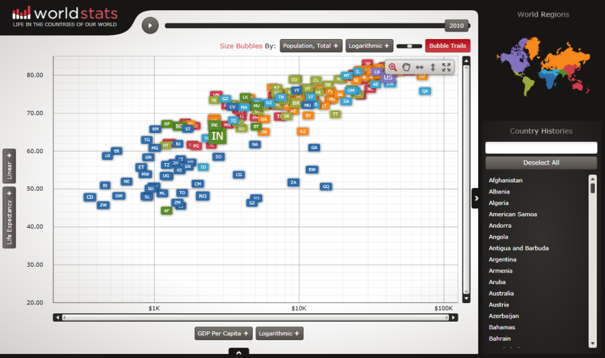
WorldStats uses a bubble chart, but Motion Framework can be used to automatically animate any type of chart included in our Data Visualization framework including maps!

Pingback: Amateur Data Scientist?: How I Built a Handwritten Digit Recognizer with 95% Accuracy | Akshay Luther