Data Visualization

Chroma Chrono: Using Color to Visualize Time

The other day, it occurred to me that one of the oldest and simplest visualizations is the analog clock–it is a visualization of time using angles on a circular scale.

So, I decided to experiment with using color to visualize time and the result is Chromo Chrono:

Chroma Chrono: Using Color to Visualize Time

It comes in two flavors. This is Pulse:

1

A series of concentric circles, going outwards from the centre, represent the hour, minute, second and millisecond. Each circle is colored on a scale that ranges from orange to black.

Depending on whether it is AM or PM, the innermost (hour) circle, gets brighter or darker. It is orange at noon and as the day progresses, it gets darker until it is black at midnight. From midnight to noon, it get progressively brighter until it is orange at noon and the cycle starts again. 

Similarly, the minute and  second circles go from orange to black once every hour and minute respectively in the AM and in the reverse direction in the PM. The millisecond circle pulses from orange to black or vice versa once every second.

This mechanism is inspired by nature–the overall brightness of the clock is an approximation of the overall brightness of the sky.

The Kinetic works on the same principle, except it has rings instead of circles and doesn’t show milliseconds:

2 anno

The main difference, however is a guide inside of each ring that makes it easier to tell the time. In each ring, the point where the color of the ring matches the color of the guide represents the time in exactly the same way as on a traditional analog clock. These points are highlighted using green arrows. If you look at the second ring closely, you will notice that it appears to be somehow moving. This an optical illusion caused by the fact that the point at which the ring and guides match is moving around the circumference of the clock.

Standard
Post-PC Era, Trends & Strategy

Welcome to the Post PC Era

Something strange and wonderful is happening. The world undergoing a radical change driven by technology at a phenomenal and unprecedented pace. Technology has of course been changing our lives for the better since the invention of the wheel. Modern society has transformed rapidly since the Industrial Revolution, following which we have had the Atomic, Jet and Space Ages. We are now in the Digital Age, marked by two key inventions: the computer and the internet. These two inventions have made our lives unrecognizable in under a generation, but now we are at the brink of a major revolution within the Digital Age itself – the Post PC Era.

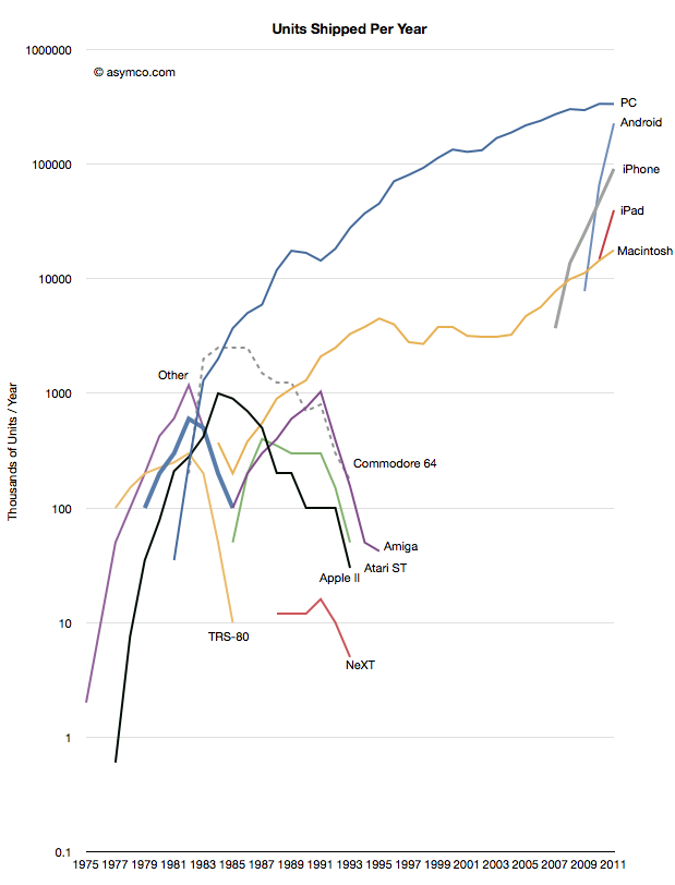
I started using computers in the late 80s, playing games like Space Invaders on my father’s Sharp “laptop” with a 7 MHz 8088 processor, two 720K 3.5″ floppy drives (no hard drive), 640KB or RAM and MS-DOS 4.1. A couple of years later I got my very own machine, a Packard Bell desktop with a 386 processor, 2MB RAM, 20MB hard drive, 3.5″ and a 5.25″ floppy drives, a 14″ VGA monitor and an external NEC single speed CD-ROM drive, and taught myself programming on it. It was primarily a DOS machine, and Windows 3.1 crawled on it. Ah, nostalgia! Those specs are laughable by today’s standards, but the basic design of laptops and desktops has essentially remained the same. What’s changed drastically over time however, is PC penetration. Back then, PCs were the largely the purview of the technologically privileged few. Microsoft was on the ascendancy, and Bill Gates the pioneer was my hero. Nearly two decades hence, the PC has reached ubiquity. Gates’ dream of a computer on every desktop, at least in the developed world, has been achieved. The following chart (from asymco) tells the story:

Asymco1

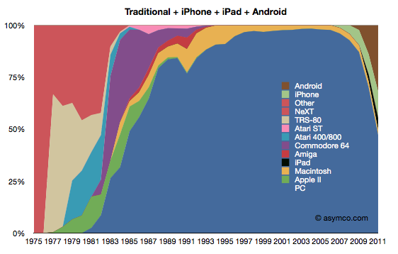
For three decades, the PC has been the primary computing device, but now all that is changing with the explosive growth of smartphones, tablets and other cheap computing devices. Another chart (from asymco) should leave you in no doubt as to the declining role of of PCs:

Asymco2

So, why is this happening? There are two fundamental reasons. The first is that the trend of computers becoming faster, smaller and cheaper has reached the stage where an incredible amount of computing power is available in an affordable device that fits in your pocket. The PC is a general purpose computing device, and was the de-facto choice for both creation and consumption activities. Now however, more specialised devices can be used, especially for consuming content. A computer to listen to music? The iPod. A computer to read books? The Kindle. You get the picture. The second is the ubiquity of fast, wireless internet connectivity – WiFi and mobile broadband. This means that you don’t need a PC to access the internet anymore. It’s far more convenient to whip out your smartphone to access your email or look up the meaning of synecdoche. The Post PC Era is all about affordable, connected, specialised devices.

As we break free from the confines of the PC, amazing new possibilities emerge. Possibilities that challenge the way we lead our lives. As an avid technologist, I have experienced the start of this change first-hand, and it has been striking. For thirty years there hasn’t been much change in the way we have used PCs apart from a general shift towards laptops versus desktops. All this changed virtually overnight with the advent of the smartphone to rule them all, the iPhone. I distinctly remember the aha moment when I realised the power of having “the internet in your pocket”. I had moved to London in late 2008 from Australia (where the iPhone wasn’t available when I left), so I was looking forward getting the iPhone once I settled in. The US Open started a few days after I arrived in London and one day, during lunch with some friends, someone asked what the current match score was. My first thought was to go to the nearest TV, but someone whipped out their shiny iPhone and looked up the score in a matter of seconds. I sat there smiling and shaking my head.I got my iPhone 3G soon after that, and it changed my life. The internet became an extension of my brain. Since then, smartphones have become almost ubiquitous in the developed world. I now have an iPad in addition to my smartphone and laptop, and I am finding myself using my laptop less and less when it comes to consuming content. Since London, I’ve been living in India where my favourite magazine Wired isn’t easily available and is expensive when it is. My tablet aha moment came when I discovered I could finally read Wired regularly by subscribing to the iPad edition which apart from being much more affordable is a better experience than the paper version since it is interactive. The time will soon come when high-quality tablets are as ubiquitous as smartphones and PCs. But we have only scratched the surface of what is possible in the Post PC Era. In future posts, I will discuss what to expect in areas such as business, entertainment, healthcare, finance, education, manufacturing, transport and software development.

So far I have only talked about the developed world, but the fact is that more than 85% of the world’s population lives in developing countries, a figure that is growing. From a global perspective, the most promising aspect of the Post PC Era is the impact it will have in the developing world. Two years ago I tweeted about a UN study which revealed that far more people in India had access to cellphones than toilets. With prices of low-end smartphones falling sharply, a future where virtually everyone in the developing world has a smartphone is just around the corner. For the majority of people in the world, smartphones will be the first internet access device. If basic text-based services such as M-PESA can have such a profound impact on millions of people, imagine the possibilities of a full-blown smartphone and other Post PC Era devices! Efforts such as Intuit’s txtWeb are commendable, but organisations looking to innovate and have an impact in this space must, like Jeff Bezos, take a long-term view.


Standard
Data Visualization

Visualizing Jet Airways India Domestic Flight Schedules

Like most airlines, Jet Airways publishes flight schedules on their website.

I thought it would be interesting to bring these these schedules to life by creating a visualization showing flights take-off and land as the day progresses.

The result is the Infragistics Flight Watcher app, a showcase for visualizing flights schedules with the Infragistics Geographic Map 2011.2 CTP:

Image
Standard
User Experience

Searchable Menus: Using Text to Navigate Complexity

The Problem

One of my favourite features of my Samsung Galaxy SII is it’s ability to create a Wi-Fi hotspot. I find myself using it regularly to give my laptop internet access when I forget my 3G USB modem at home or when I travel to a city where the modem’s carrier doesn’t have 3G services.

The hotspot works like a charm, but getting to the menu item to activate it however, is a pain as the following screenshots show:

2image

Similarly, the other day I was editing a document in Word and wanted to edit the header. Call me stupid, but I couldn’t figure out how to do it! After a couple of minutes of trying to figure it out, I ended up having to Google “Word 2010 Header”.

Both these scenarios highlight the huge and ever-growing problem of navigating complexity in software. But it’s not as if software developers are not trying to address this issue. Microsoft for example, has put in a massive amount of effort in making the Office menu usable as it grown more complex, and their latest solution is the Office Ribbon. You can read the story of the Office Ribbon, and take a trip down memory lane. I “borrow” a couple of slides from Jensen Harris’ deck to quantitatively illustrate how menu complexity has grown over the years:

Image
Menus2
So how do we navigate this complexity and get to what we need quickly even if it is buried several levels deep? What we currently do is learn how to get to a particular menu item, then try to memorise it for the future. It may take us a few tries before it is committed to memory. Then, everything is OK until a new version of the software is released, we have to learn it all over again. The level of angst this causes has probably been unknown until social networks came along and allowed users to give instant feedback. It is clearly evident from the number of exclamation marks that accompany Facebook status updates every time the Facebook layout changes. Yes, we ultimately get used to it the new layout and the new way of managing privacy, but the amount of time wasted is phenomenal!
 
This is certainly not the shortest distance between “our brain thinking we want to do something” and “actually performing the activity”. The ideal solution is of course, the device just reading our thoughts, and while there is some amazing research going into making this a reality, we are still stuck with giving commands to our machines for now. Meanwhile, Apple is once again pushing the boundaries of user experience, but voice commands have clear limitations and are not suitable for general purpose use. At least not yet.
 

The Solution

I believe there is a simple, elegant solution to the problem that we can apply immediately. It is the idea of making menu items searchable using text, or simply “Searchable Menus”.
 
Specific implementations of this proposed “Searchable Menus” pattern would of course vary according to device, platform and type of application.

Consider the scenario of firing up the WiFi hotspot on my phone. If I search for “hotspot” this is what I get:

4image
 
The Google Search Android app already searches apps, text messages, and visited web pages, so why not menu items as in the following mockup?
 
5image
 
Similarly, in Word, a “Command Search” pane or similar UI element could be used to enable searchable menus.
 
Revisiting the header editing scenario, one would simply need to type in “header” and get a list of relevant menu items as follows:
 
3image

Searchable menus can be context sensitive. For example, I would just select some text and type in “super” into the “Command Search” , which would list relevant commands:

1image
 
This way, I get Word to do what I want in what soon after me thinking “I want to make this text superscript” and getting Word to do it for me.

Searchable Menus also solves the problem of relearning software every time a significant change to the UI is made.

Predictive analytics could be used to optimise the search results for the particular user. For example, often used commands could appear larger or nearer the top of the search results or use colour to stand out. It could also be used to suggest items that have the same meaning as what has been typed in, so we don’t have to remember exactly what the menu item is called. Relevant data could be stored in the cloud so that moving from one platform or device to another would be smooth and seamless.

Ultimately, I believe Searchable Menus have huge potential to make users more productive in an increasingly complex world. Further, I think they have the possibility of changing our thinking away from a “one size fits all” solution (e.g. designing menus around the “the 80-20 rule”) to one that is more customised to the user.

What do you think?

Standard
Uncategorized

A New Year, A New Blog

Over the past 18 months or so, I have been blogging here on Infragistics-related topics as well as more general topics.
 
From now on you will find me posting on Infragistics-related stuff over at my company blog at http://community.infragistics.com/blogs/akshay_luther, but I will still continue to post here on other topics that interest me and in some cases, repost content from my company blog.
Standard
.NET, Data Visualization

Exploding Bubbles: Visualising Multi-dimensional Data using Infragistics Silverlight Controls (Part 1)

The Short Version

You can interact with the chart by:

  • Left-clicking on bubbles to explode them
  • Right-clicking on exploded bubbles to implode them

[Run Exploding Bubbles]

UPDATE: Exploding Bubbles was made into a showcase application by Infragistics. It was restyled and renamed to Population Explosion. The restyled version can be found here:

[Run Population Explosion]

The Long Version

In a fascinating video titled Nano-data and Now-Casting: The Analytics Revolution, MIT Sloan Professor Roberto Rigobon says,

“The world has a lot of data, now available [sic]. (But), the world has very little information.”

In a previous post, I touched upon the need for innovative ways to make meaning from the large amount of data that we have access to today and the growing importance of analytics:

“Massive amounts of data – either publicly available, or within enterprises – is a defining feature of computing today, and of growing importance for tomorrow.  In fact it’s given rise to a new discipline: data science. As the amount of data grows, traditional methods and tools for making sense of all this data break down and new innovations are necessary.”

One of the ways to understand data is interactive data visualisations. Multidimensional data is especially tricky to visualise because of the complexities of each data point, but if done properly, can provide real insight from the macro- as well as micro-level. A great example of this is the “exploding bubbles” technique, presented by Hans Rosling in a TED Talk from 2006. Look for exploding bubbles starting from around 9m30s into the video.

Inspired by this, I developed the Exploding Bubbles application using Infragistics Silverlight and Silverlight Data Visualization controls.

Here is a video of Exploding Bubbles in action:

This is what the application looks like when you first run it:

Image001

On the left you will notice a pivot grid showing multidimensional data. On the right is a bubble chart, a visualisation of that data.

The pivot grid shows global “health and wealth” statistics. The data is plotted on the chart in the following way:

  • Population is depicted by bubble size
  • GDP Per Capita is depicted on the X-axis on a logarithmic scale
  • Life Expectancy is depicted on the Y-axis on a linear scale

You can interact with the chart by:

  • Left-clicking on bubbles to explode them
  • Right-clicking on exploded bubbles to implode them

You can also interact with pivot grid by expanding or collapsing rows – the bubble chart is synchronised with the pivot grid’s data.

Image002
Image003

You can download the source code from here: http://dl.dropbox.com/u/15104486/ExplodingBubbles.zip

Have fun!

In following posts, I will talk about the implementation details and cover aspects of the following Infragistics controls/features:

  • Pivot Grid
  • Data Chart
  • Excel
  • Dock Manager
  • Motion Framework
  • Theming

In the meantime, for more details of what you can achieve using these and other Silverlight controls from Infragistics, you can browse through the samples and read the documentation.

Read the rest of the posts in the series:

Part 2: Data Aspects

Part 3: Visualisation Aspects

Part 4: Docking, Theming, Cloud Deployment

Standard
Gadgets

Samsung Galaxy SII: The best smartphone you can buy today?

When the iPhone was introduced, it was a true game-changer, defining what it meant to be a smartphone. For a long time it has been the best phone available. By far. It has been the phone that every other phone has tried to live up to.

However, since Android phone sales overtook iPhone sales about a year ago, it’s been hard to miss the clamour surrounding Android.

When my close-to-three-year old iPhone 3G died a few weeks ago, my interest in Android turned from academic to pragmatic. I have been unabashedly enthusiastic about Apple products, but wanted to see what the Android fuss was about, instead of just buying an iPhone 4 or waiting for the iPhone “5”. 

It became clear, at least to my mind, that Android is a better operating system than iOS, and that surprisingly, Apple is playing catch-up. For example, features such as unobtrusive notifications and cloud-syncing have been available in Android for a long time, but are only appearing in iOS 5 now. Android has support for Flash. It also has support for creating a WiFi hotspot that uses the phone’s connectivity!

There’s more to like. The iPhone’s user experience is extremely polished all-round, but you’re pretty much stuck with what Apple gives you. On Android however, you can customise pretty much every aspect of the phone. For example, you can replace the default homesreen, lockscreen, keyboard, sms application or web browser. Android is a lot more open and flexible. For example, you can copy a directory of videos directly on to your phone without having to use iTunes as an intermediary. Or you can automatically change various settings via applications like Tasker and Locale. This is extremely appealing to a “power user” like me. Also, I must say I was quite impressed with the user experience of HTC Sense (HTC’s UI on top of Android).

There are of course far more apps in the Apple App Store versus the Google Android Market, but the Android market is growing fast and developers are increasingly choosing to move to Android’s far less restrictive policies. Apple should be worried.

And then there’s the hardware. The likes of Samsung, HTC and LG are churning out phones at a frantic pace. That means the cutting edge is found there. So, despite HTC’s great user experience, I bought the Samsung Galaxy SII. And I couldn’t be happier with it.

Here’s what I love about it:

Screen: It has absolutely gorgeous 4.3 Super AMOLED Plus screen with very deep blacks and colours that pop-out. It’s hard to imagine using anything else after spending some time with it.

Speed: It has a 1.2 GHz dual core processor that just screams.

Build: At 8.5mm, it’s the slimmest smartphone in the world. It’s also incredibly light. It has a lovely, sleek minimalistic all-black design with an unobtrusive gunmetal insert. Holding it in your hand, it’s hard to imagine there’s so much inside!

Storage: 16GB built-in plus an SD card slot.

Camera: Excellent 8MP camera plus a front-facing camera for video calls.

The rest:

Battery life: The battery life is a little disappointing, even though it’s supposed to be better than most other “superphones”. I often find myself needing to recharge it after half a day of moderate use. But fortunately, “there’s an app for that” 🙂  I haven’t tried it, but JuiceDefender looks promising

User Interface: Samsung’s TouchWiz 4.0 UI is so-so. Again, this is easily fixed. I replaced the homescreen and keyboard with GO Dev Team’s awesome GO Launcher EX and GO Keyboard.

I’m convinced that not only is the Samsung Galaxy SII superior to the iPhone 4 and even the 4S on both fronts (hardware and software) but is the best phone you can buy today (at least in India).
Standard
Tips & Tools

Pasting Text Without Formatting

Today I discovered PureText+, a little gem of a tool.

I copy+paste text from one program to another several times a day. By default, this preserves the formatting of the copied text, and I get around this copy+pasting into a plain-text editor (my editor of choice is TextPad) as an intermediate step.

PureText+ skips this intermediate step and pastes "pure" text without formatting. You simply have to use Windows+V to paste instead of Ctrl+V.

(It's open-source and written in C#)
Standard
Data Visualization

Stats are Sexy

If you want to know what the future holds, or find out about the most brilliant and innovative work being done in any field, there is no better freely available resource than TED videos. My inevitable reaction to a new TED video is shaking my head and thinking “brilliant, just brilliant”. Like this one from Aaron Koblin, in which he talks about his works spanning data visualization, crowdsourcing, digital art and social experimentation bordering on cheekiness.

Massive amounts of data – either publicly available, or within enterprises – is a defining feature of computing today, and of growing importance for tomorrow.  In fact it’s given rise to a new discipline: data science. As the amount of data grows, traditional methods and tools for making sense of all this data break down and new innovations are necessary. A defining piece of work in data visualizations was Hans Rosling’s work on GapMinder which he presented a few years ago. The world got to know about it through TED:

At Infragistics, our product range includes general-purpose high-performance data visualization controls, making it easy for you build rich, powerful data visualizations for web, desktop and mobile applications. One of the innovative features is the Motion Framework, which allows you do visualize how data has changed over time, just like in the video above.  The WorldStats sample shows the same Gapminder data as in Hans’ video: http://labs.infragistics.com/motion-framework/world-stats/

Image001

WorldStats uses a bubble chart, but Motion Framework can be used to automatically animate any type of chart included in our Data Visualization framework including maps!

Standard